From its humble beginnings as small candle-making business started in a one-room schoolhouse to its evolution into the international corporation with $200M annual revenue that it is today, Burt’s Bees is the rare company that has managed to be extraordinarily financially successful, while maintaining firmly rooted in its commitment to high quality natural ingredients and the sustainable and ethical business practices on which it was founded.
By 2015, though Burt's Bees as a brand maintained a strong base of passionately loyal, devoted, and eco-conscious customers, their online experience was failing to engage its users — burtsbees.com suffered from low repeat visits, purchase conversions, cross-category and product-finding explorations. Though its customers spoke lovingly of the brand, were vocal about their favorite and not-so-favorite products and ingredients, and eager for the release of and expansion of existing product lines, that enthusiasm was dampened by the site's transactional-focus, its campaign-driven content, and the minimizing of the brand narrative, mission, and values.
In May of 2015, I joined the team at Swirl to take on the challenge of re-architecting the Burt's Bees experience so as to deliver an immersive, interactive experience that would engage users, and encourage prolonged stays and return visits.
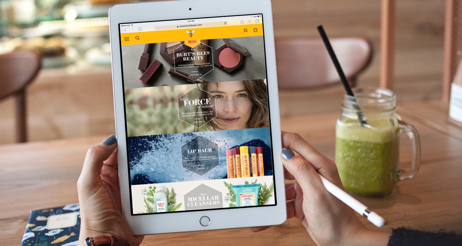
I led UX Design efforts, tasked with defining new global navigation patterns and interactive models, while partnering with Swirl's in-house Lead UX Designer to redesign burtsbees.com mobile first. We worked closely with the Creative Director, Visual Design Lead, Copy Writer, and Content Strategist to coordinate efforts in order to meet a tight deadline.
One of our main goals was a refreshing one for an ecommerce site: focus less selling and more on creating opportunities for users to discover and learn about products and ingredients suited to their needs. Our intent was to transform the site into a source of inspiration, support, and guidance for its users.
Furthermore, as part of a larger strategy to establish Burt's Bees as holistic health brand dedicated to natural, sustainable products and eco-conscious lifestyle, the redesigned site would mark the growth of Burt’s Bees into new product categories, such as supplements and an expanded selection of green beauty and skincare products, as well as its launch of brick and mortar stores.
Both Burt's Bees and Swirl had already assembled a wealth of product, market, and user research, strategy documents for how best to achieve a successful redesign and repositioning, as well as high-level architecture diagrams - all invaluable in allowing the team to get up to speed and align our thinking quickly.
With a solid foundation established, we decided to work concurrently in a series of sprints - UX, Visual Design, and Copy - to move forward iteratively and rapidly in crafting the new experience.
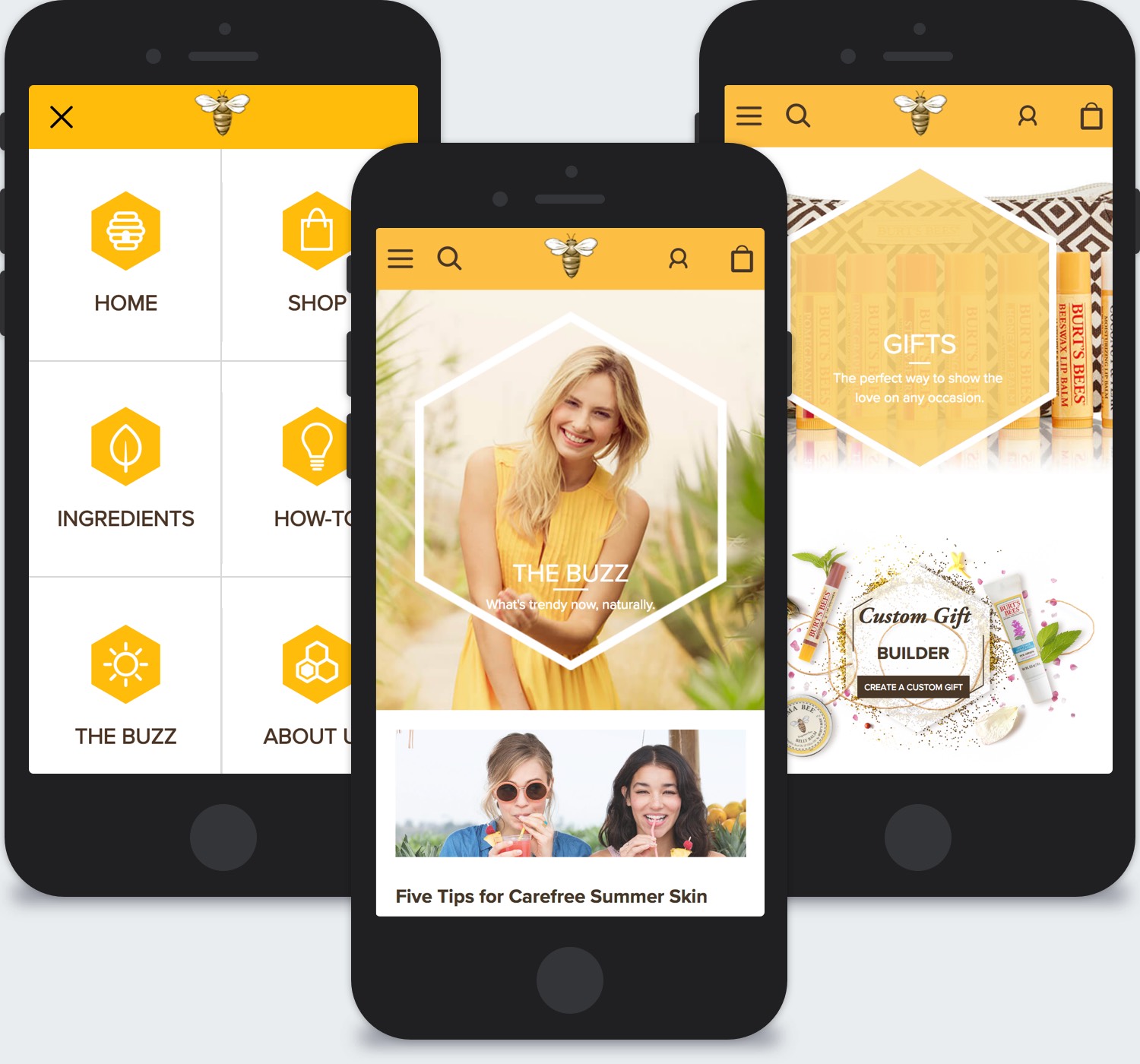
The honeycomb, or "hexacomb" as it's commonly referred to within the company, has been a key symbol to Burt's Bees since its inception. It has served as a reminder of its past - in that its first products consisted of beeswax and honey - as well as a trenchant symbol of its commitment to future sustainability. In 2014, as part of its campaign to raise awareness of the disturbing disappearance of honey bees, Burt's Bees' not only removed the "B"s from its site, but pledged to plant 1000 wildflower seeds for each Twitter or Instagram post dropping the letter "b" and using the hashtag #BringBackTheBees.
Consequently, we took the hexacomb as inspiration for our early navigational explorations, seeking to maintain the integrity and importance of the symbol, to modernize it to align with the new vision, as well as its specific application in the new retail stores.
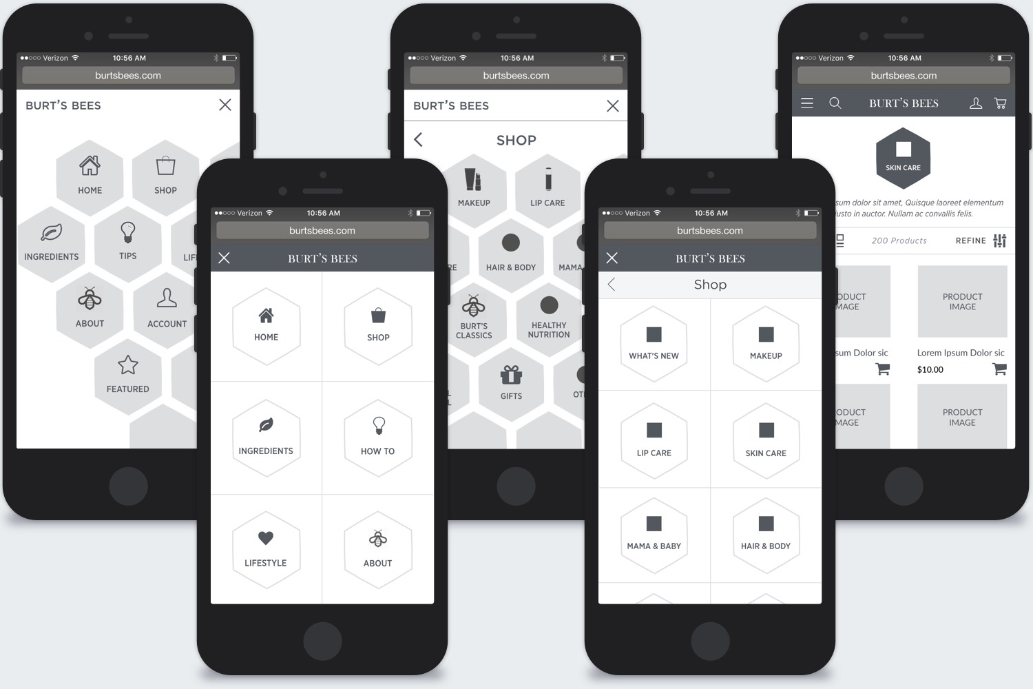
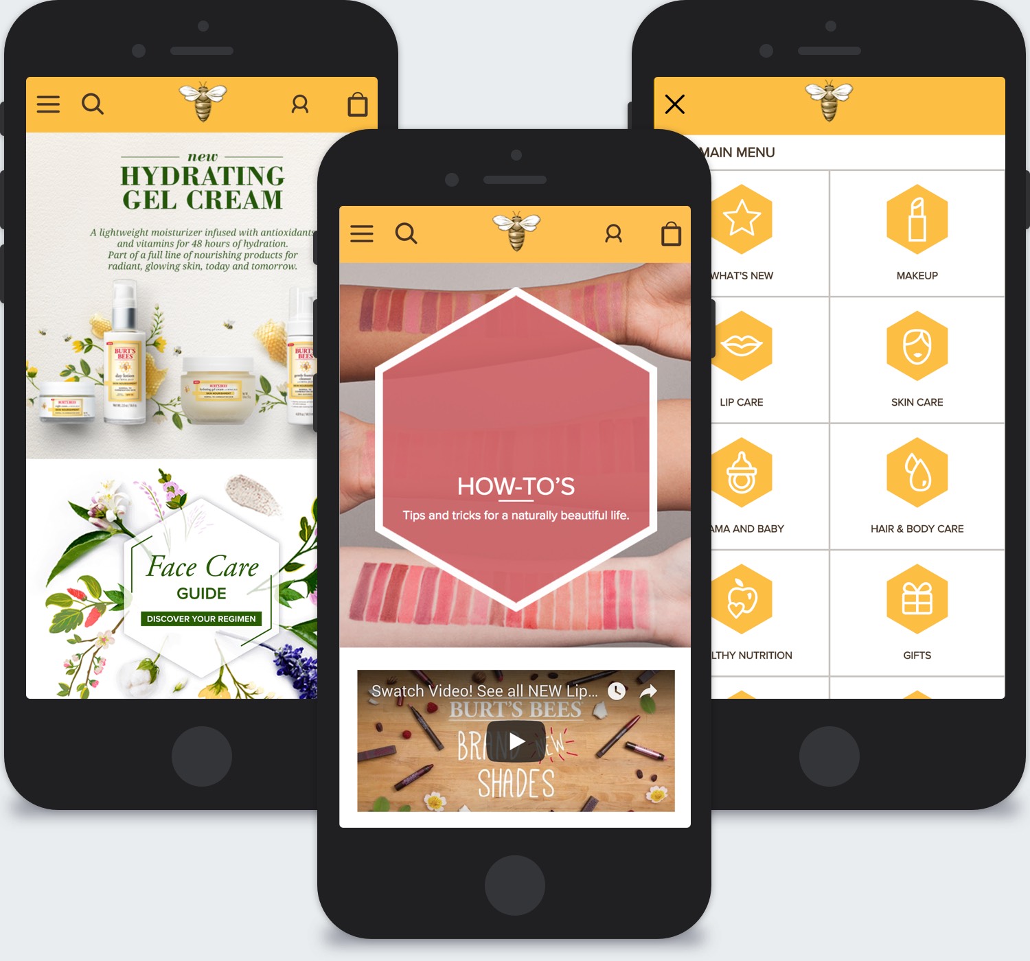
Once the high-level navigation concept was defined and approved, we moved on to designing key screens representing all levels of navigation, adjusting the proposed architecture model as we progressed in order to accommodate mobile-friendly content and standards.
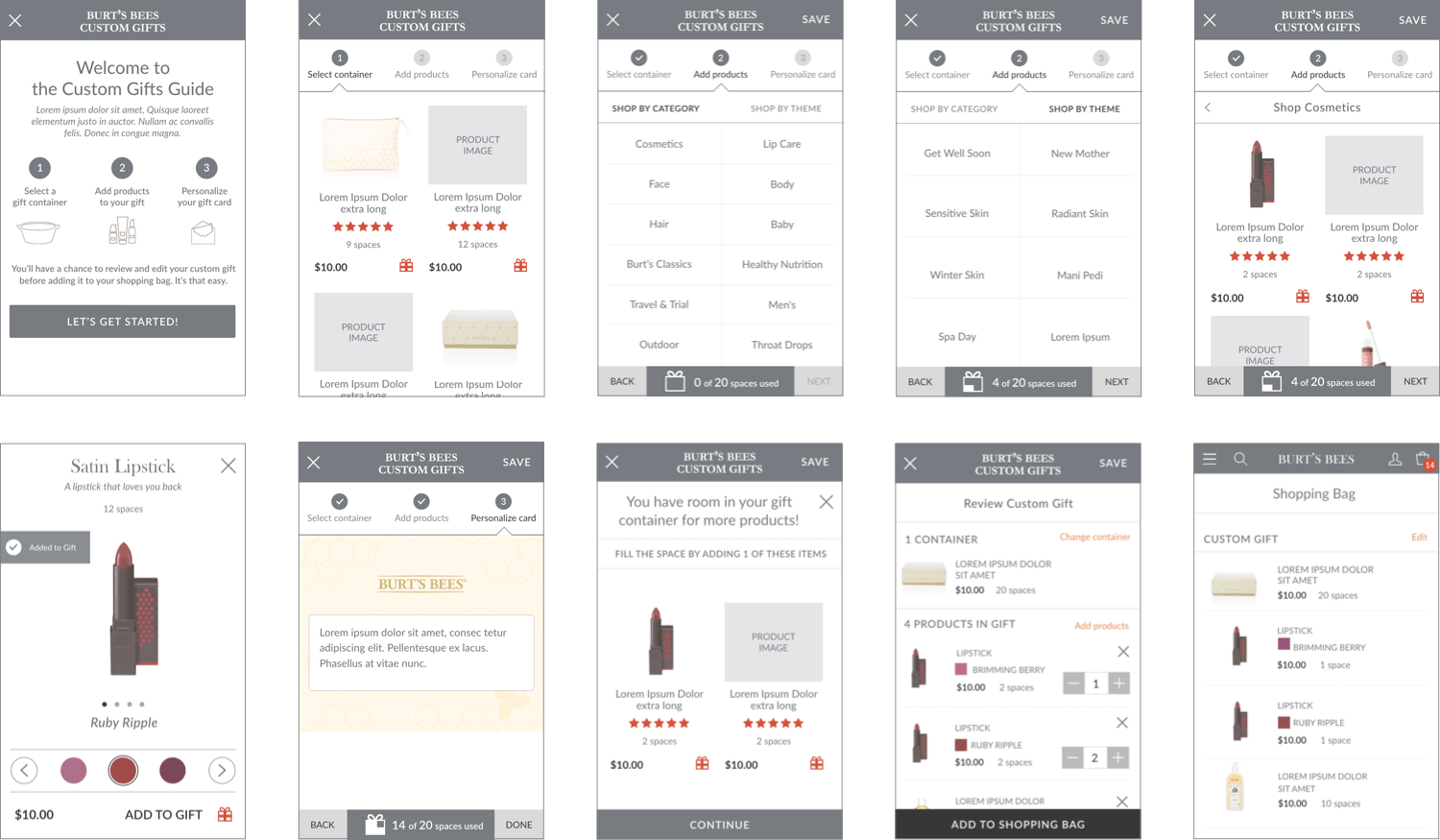
Key to the goal of engaging users was optimizing flows of current tasks, making them more personalized and customizable. Burt's already had great success in sales of its pre-made gift baskets, yet feedback from users clearly indicated that they were looking for more options and flexibility in their gift giving.
Rather than develop in-house, we were to leverage a 3rd party gift basket creation tool with predefined flows; in order to determine quickly the extent to which it could be customized, we began by conducting brief comparative and competitive research to identify ecommerce sites that had leveraged the same tool and assess how much they had successfully changed it to align with their brand and user experience.
While minor changes were possible, unfortunately, we learned that the primary flow - choosing a container, then choosing gifts - simply couldn't be altered. While we were concerned that this would be potentially confusing to users, we moved forward by designing concepts that made this flow clear throughout the process, so as to avoid possible confusion.
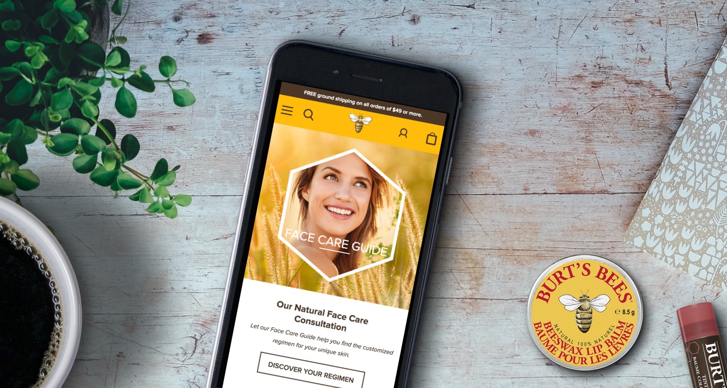
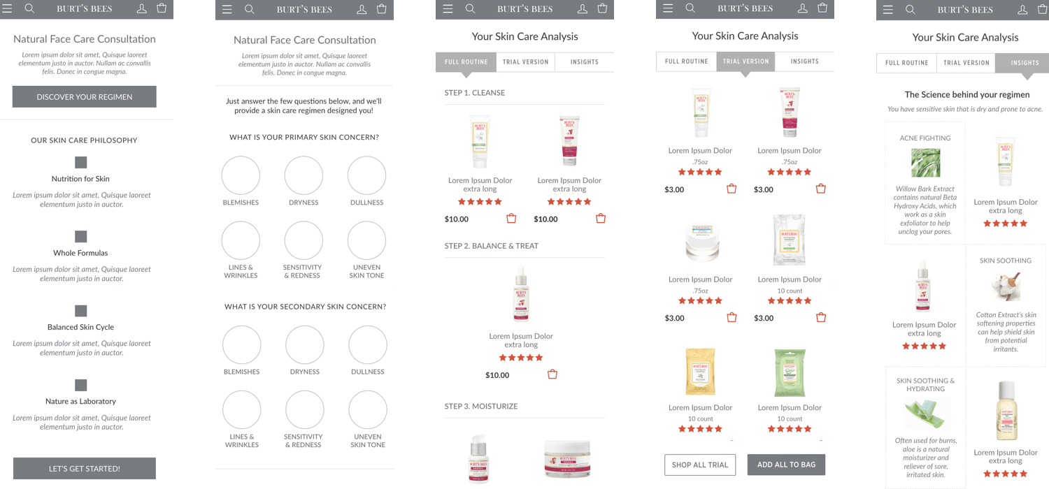
As Burt's was expanding its skincare and makeup lines, developing new guides, as well as optimizing existing ones were priorities of the redesign. The skincare guide represented a natural opportunity to introduce users to new product lines through personalized product recommendations, as well as to present additional information about active ingredient(s) within products selected for them, which they could choose to explore further.
Furthermore, understanding that beauty consumers, especially those purchasing online, are more likely to try a new product if their initial investment is minimal, I proposed presenting users with the option to purchase travel and trial sized versions of products included in their recommend routine.
Visual Design sprints began with the second UX sprint, so we worked closely with Creative Director Bo Jacobsen and Visual Design Lead Cara Mia Tontodonato, with whom we had worked previously on the Brita Splash Studio, to ensure that we were aligned throughout, and that there would be no differences between UX and visual design deliverables. The redesigned Burt's Bees was launched in October of 2016, and saw immediately increase in user engagement (length of visits, pages visited), return visits, and sales resulting from new product-finding features.